The Confident Spectrum: Designing with Reds, Pinks, and Everything Between

By: BeautiTone
In interior design, few colours command emotional resonance quite like red and pink. They are shades of warmth, vitality, softness, and human connection these tones can shift effortlessly from spirited energy to quiet reassurance. As designers, we often return to these hues not because they are showy or seasonal, but because they hold a rare ability to transform the way a space feels, moves, and breathes. Decorating with reds and pinks is not about romance or thematic occasions; it is about intention, atmosphere, and the subtle art of guiding emotion through colour.
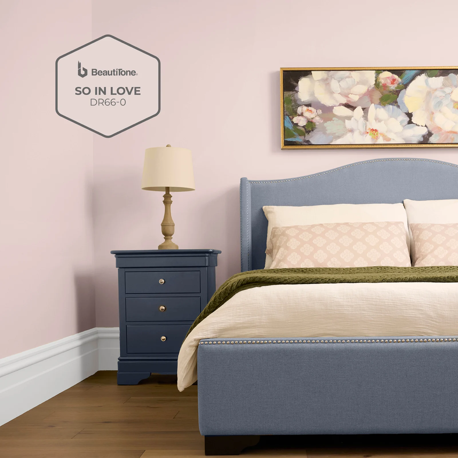
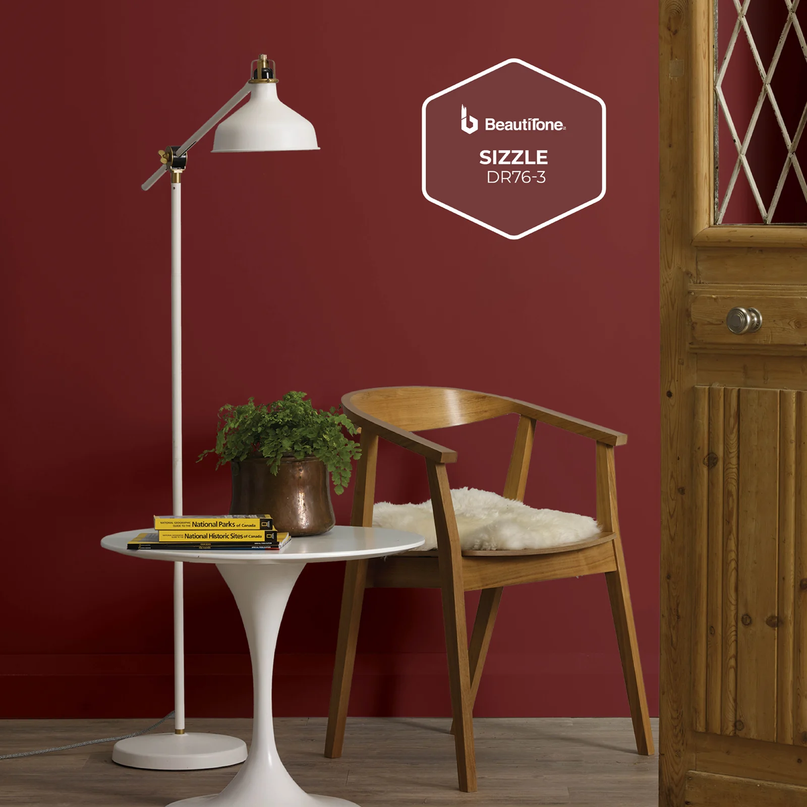
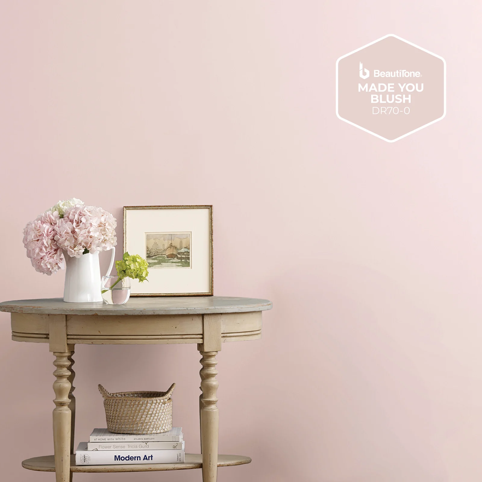
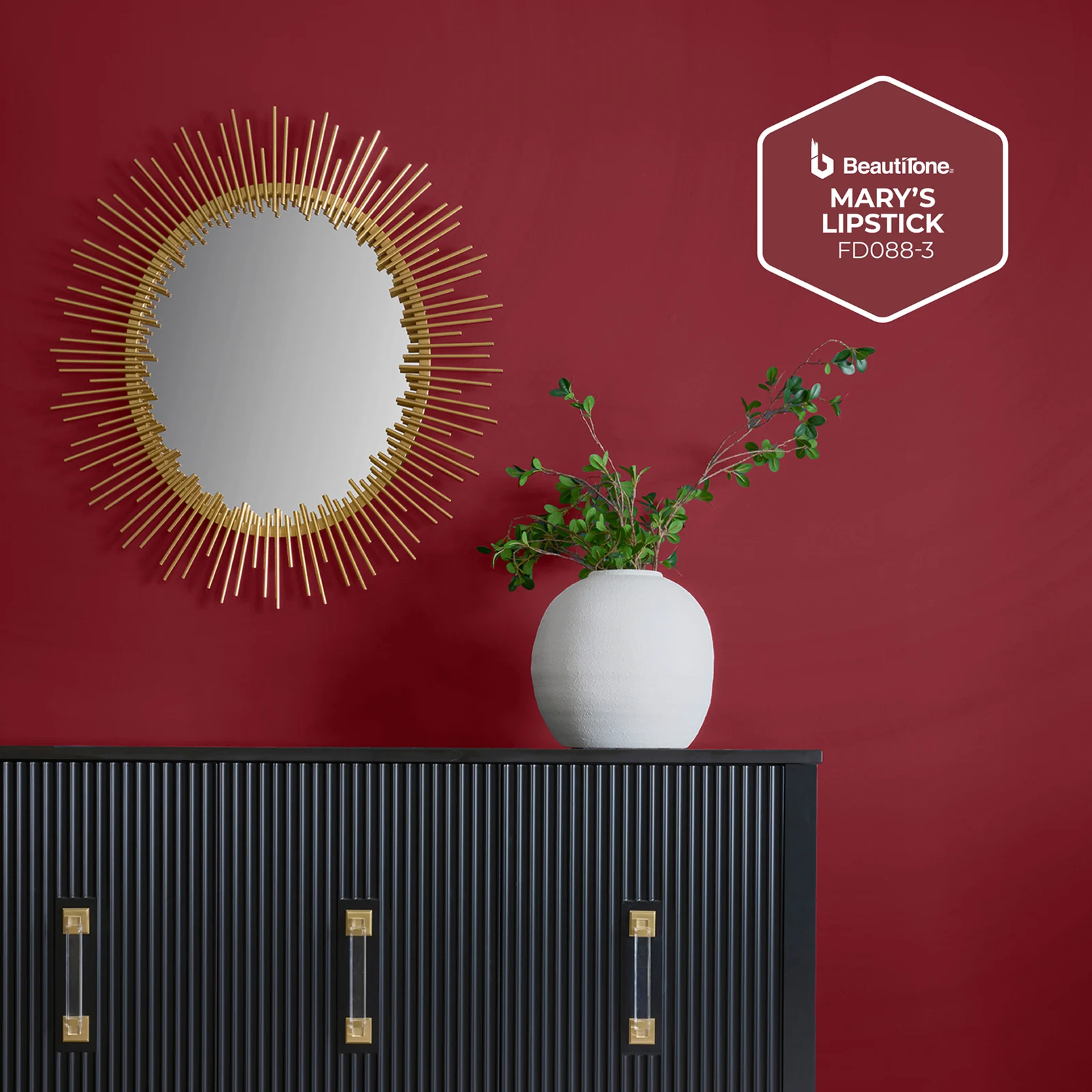
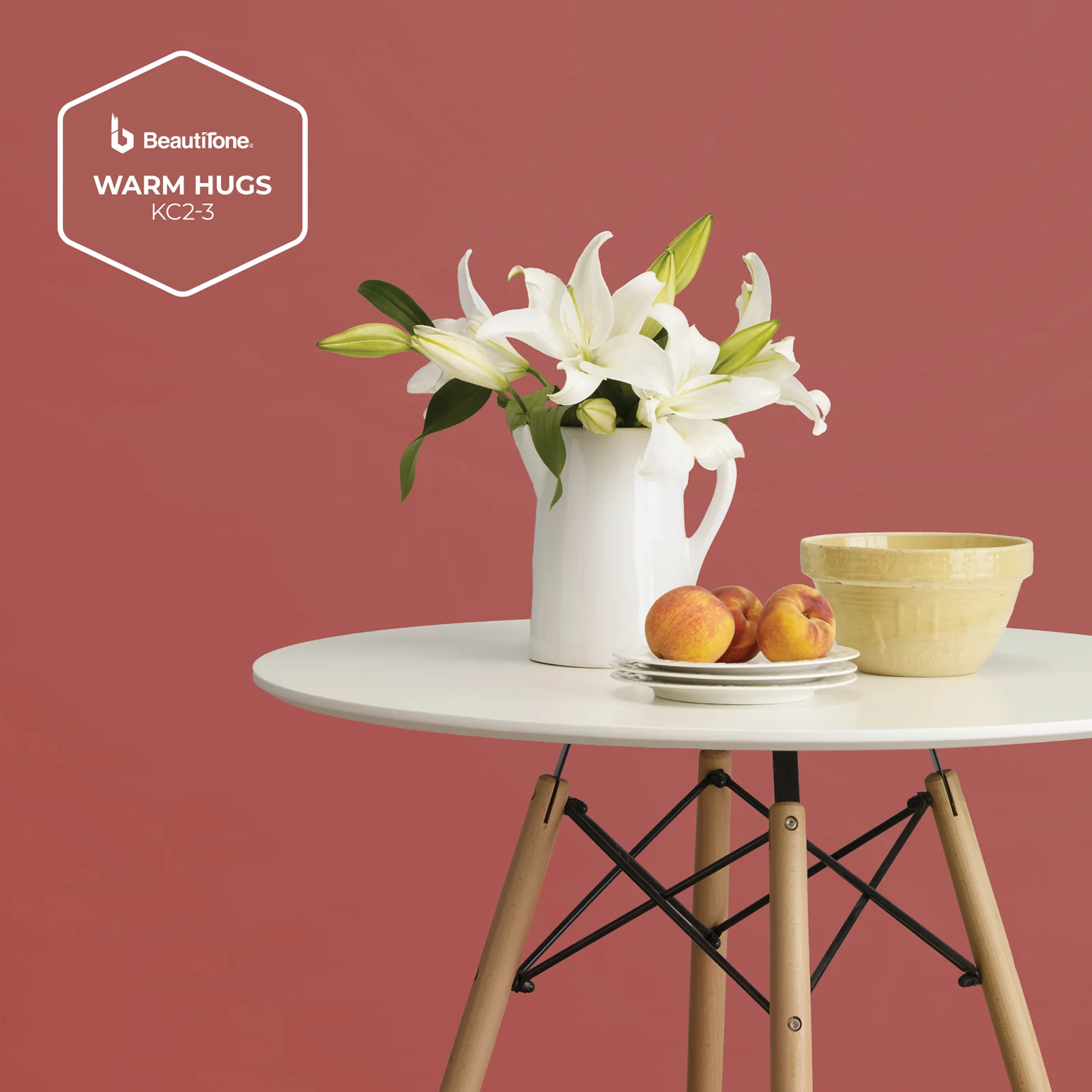
What makes the red–pink spectrum so compelling is its range. Within it, you’ll find warmth and coolness, depth and lightness, emotion and optimism. Here are 5 beautiful hues to decorate with So in Love, Made You Blush, Warm Hugs, Sizzle and Mary’s Lipstick. Each one invites its own design language, individually or layered together. Whether you lean toward a soft, airy envelope or crave drama and depth, pink and red offer a framework that feels both expressive and timeless.
Creating Beautiful Spaces with Pink and Red
Reds and pinks exist on a continuum that begins with the gentlest whisper and builds toward full-bodied confidence. When applied with thoughtfulness, these hues can reshape a room’s atmosphere with extraordinary precision.
Pink is often misunderstood. In design, it is not a novelty colour; it is a tool for creating softness, warmth, and a sense of approachability. A nuanced pink, especially one with a yellow or blue undertone, can behave almost like a neutral. It will quietly support natural woods, stone, textiles, and architectural lines. Designers use pink to soften sharp edges, introduce a note of freshness, or create a luminous backdrop that feels uplifting without overwhelming.
Red, on the other hand, is architecture in itself. It draws the eye, carves out presence, and grounds a space with emotion. Some reds are bold and theatrical, others warm and enveloping. Even the most dramatic reds can feel surprisingly sophisticated when they’re balanced with simple, everyday elements like soft textiles, natural light, and clean lines.
Together, red and pink can create moments where contrast becomes harmony, and vibrancy becomes elegance. Their interplay is a masterclass in pairing warmth and coolness, softness and strength.
Pairing Pinks and Reds
Designers know that pairing red and pink is less about daring and more about balance. These hues are harmonically connected; they share a colour family but diverge through undertones, depth, and temperature. When layered with intention, the combinations can be breathtaking.
Here’s how to approach it:
Use undertones as your guide. Pair warm pinks with warm reds (So in Love with Warm Hugs), and cool pinks with cool reds (Made You Blush with Mary’s Lipstick). This creates cohesion.
Let depth create hierarchy. Deeper shades like Sizzle or Mary’s Lipstick ground a palette; lighter shades like Made You Blush and So in Love bring lift and breath. Together they create rhythm.
Introduce neutrals that support, not compete. Warm whites, sandy taupes, natural woods, and soft charcoals keep pink–red palettes feeling curated rather than busy.
Add natural textures for balance. Reds and pinks thrive alongside materials with organic softness—linen, wool, clay, stone, unfinished wood. These textures ensure the colours feel at home.
Know where to place intensity. Use the most dramatic reds where you want energy. Use the softest pinks where you want serenity. Let each colour play the role it was designed for.
Why Red and Pink Belong in Contemporary Homes
Red and pink are more relevant than ever in homes because they bring warmth, personality, and a sense of intention to any space. These colours make rooms feel expressive, welcoming, and lived-in.
Whether used alone or together, the five colours explored here: So in Love, Sizzle, Made You Blush, Mary’s Lipstick, and Warm Hugs. They all offer endless possibilities for shaping a home’s atmosphere. They show that colour is more than decoration; it is mood, storytelling, and identity expressed through the spaces we inhabit.
Red brings confidence and presence. Pink adds softness and lift. When these two colour families come together, they create environments that feel balanced, inviting, and authentically human